by The Open University
Available in 42 free installments
Owner:
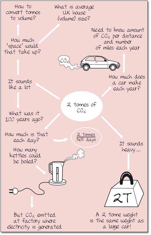
Read this statement and sketch out on paper or in words what you think might work (on paper) as a visual aid: ?A typical UK home produces about 2 tonnes of carbon dioxide (CO2) each year.?
These were our ideas (summarised here as words) although we originally did this as drawings, scribbles and words on a large white board, all contributing and commenting as we went along.
We felt we needed to show how ?big? 2 tonnes is to the audience ? we could have done this by showing the amount of void space in a home (is it less, more or the same as 2 tonnes?). We could have estimated (or calculated) how much CO2 is made per day, per kettle boiled, or relate to some typical event and related this to something else like CO2 from cars, or factories. It did depend, however, on where (exactly) this CO2 came from and where it was emitted.
It was also important to know what the context was ? were there other types of emissions due to UK homes? Were homes the major CO2 emitters? Either way, it seemed that a graphic of a typical UK home would be useful, along with its typical characteristics (e.g. number of rooms, heating system, age, construction, inhabitants, etc.). This seemed like it could easily take two or three visuals.
Another idea we thought about was the use of smoke to represent the CO2, although we weren't sure if this was realistic. Could we use a smoky trail or picture in our visual? This got us to thinking about houses 100?150 years ago (when the environment would have been much smokier). Could we try and compare the amount of CO2 emitted back then to today? Or even 10 or 20 years ago? This could give some kind of historic trend which might be useful. We could express it as a chart (either a line or bar chart) or even in a basic table. If the data were very different we could try to determine how many ?fold? increase or decrease there has been over time ? like ?there is 4x more today than 10 years ago?. That would make for an interesting summary statement too.
The more we explored the potential visual ideas the more possibilities we seemed to find ourselves having. One could already sense that it wouldn't be too difficult to come up with a very interesting story about CO2 emissions from UK homes.